Holiday 2021 Promo15% off all artwork, limited time offer!

Newsletter Subscription

Subscribe to my newsletter to receive 4 to 5 emails per year where I highlight important news, available originals, and seasonal specials.

Blog Category: Step-by-steps

How to Mount Canvas on Board

I used to mount canvas on board with Frank's PH Fabric Adhesive. I demonstrated how to do it on a previous blog post: Canvas and the Icarus Board: Final PostAlthough this method worked pretty well, the glue would always moisten the canvas which would take a long time to dry before I could varnish it. I finally found a double-stick adhesive that is suitable for rough surfaces like canvas.
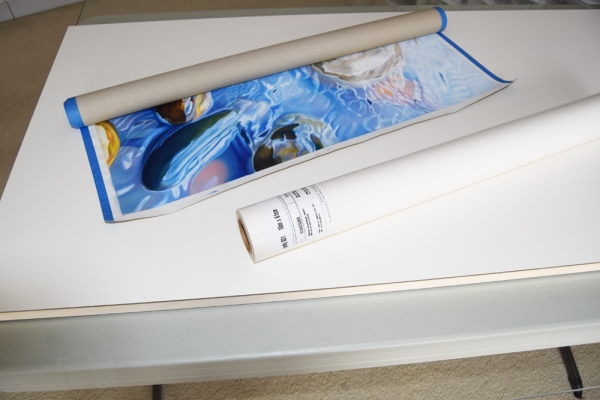

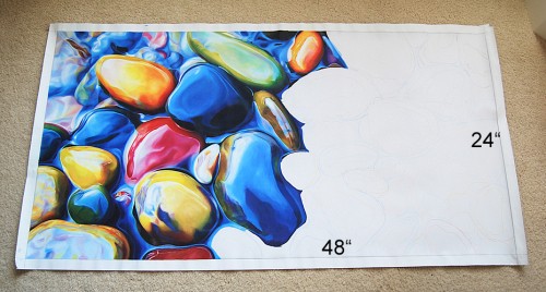
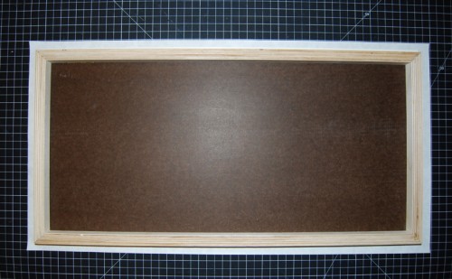
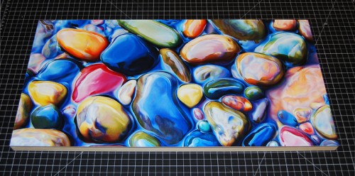
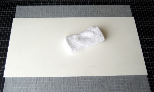
Above are my finished canvas and a roll of adhesive on top of a 24" x 48" Claybord.
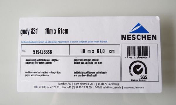

Gudy 831 is a very aggressive double-stick adhesive especially suitable for application on rough or textured surfaces. It's acid free (pH 7), passed the photo activity test (PAT), and will not dry out or discolor with age. It's available on rolls with a single release liner. Easily applied by hand, it will never dry out or discolor with age. Gudy 831 can be purchased online from Talas in different size rolls.
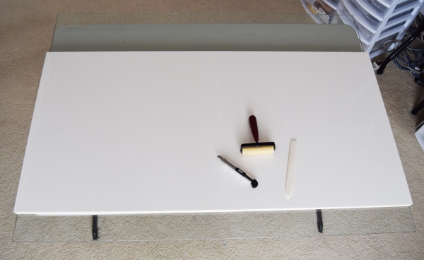

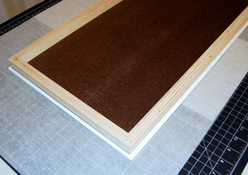
After carefully unrolling the adhesive onto the surface of the Claybord (sticky side toward the board), I burnished it with a brayer and trimmed the excess around the edges. I punctured the air bubbles with an X-Acto knife and burnished until the air was all gone. 
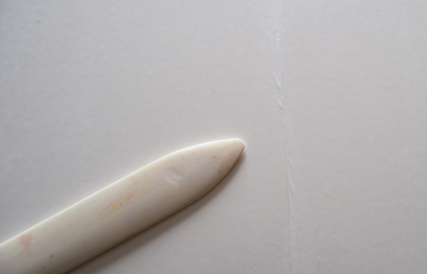

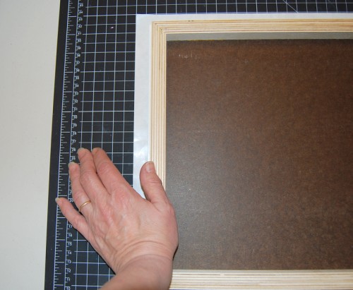
Here's a close-up of a seam where I had to join two separate sheets of adhesive because the roll wasn't wide enough. Again, I pressed the seam with a burnisher.
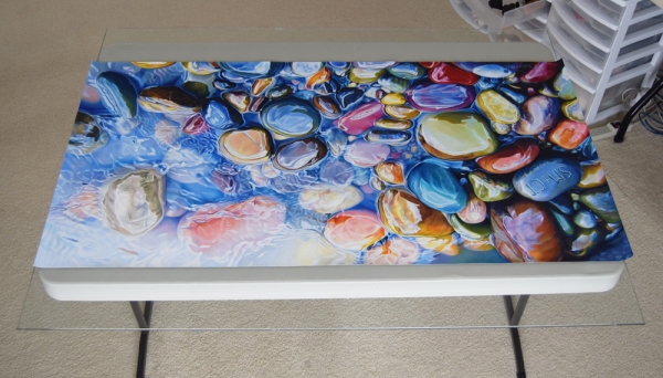

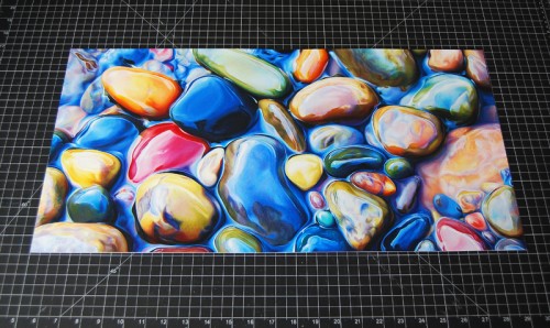
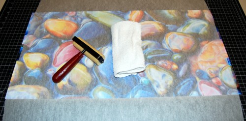
This is the canvas ready to be mounted, after I trimmed the white edges. At this point my piece measures 24.5" x 48.5", half an inch larger than the board, to account for possible misalignment during mounting. 
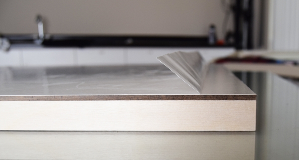

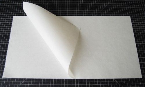
I created a fold on the release liner to expose a 1" wide section of the tacky area.
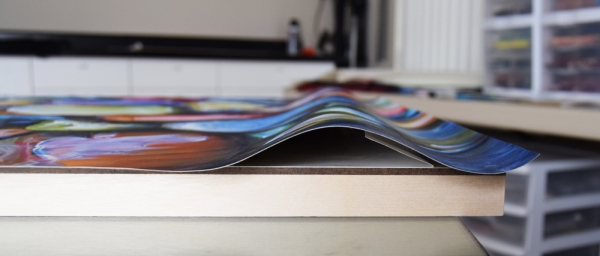

I positioned the canvas over the board and, when perfectly centered, I pressed down on the canvas over the exposed 1" section of adhesive.
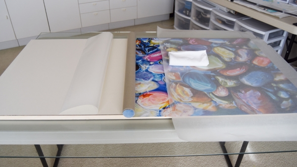

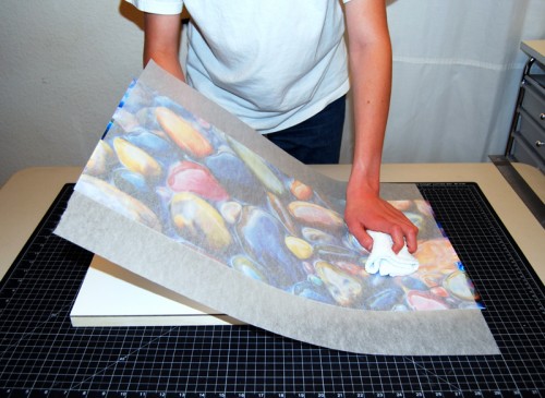
Then I slowly pulled away the release paper while unrolling the canvas over the adhesive. With a sheet of tracing paper covering the canvas, I gently rubbed the surface with a rag until all the release paper was pulled out.
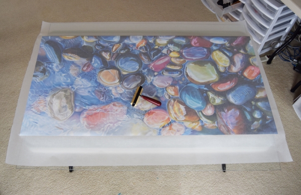

I rolled a rubber brayer all over the surface protected by tracing paper.
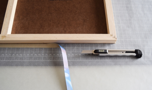

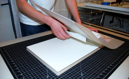
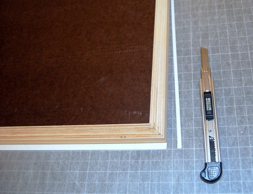
I turned the board upside down and trimmed the extra canvas with an X-Acto knife.
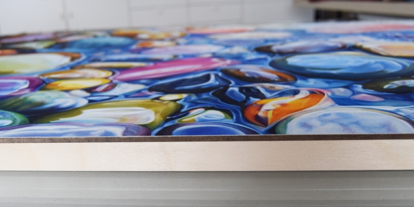

To achieve perfect cuts I used a fresh blade for each side of the artwork.
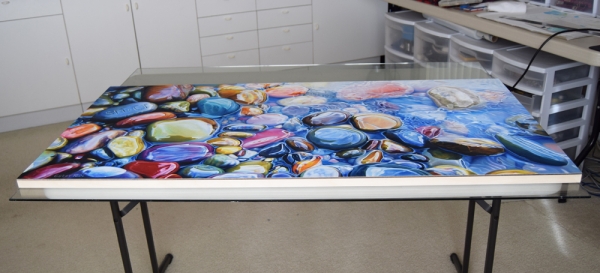

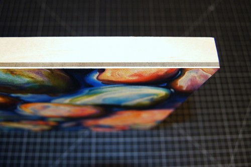
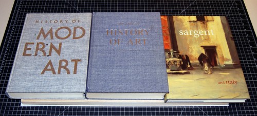
Finally I placed the board under heavy books overnight. Using Gudy 831 allowed me to begin varnishing the day after mounting the canvas.
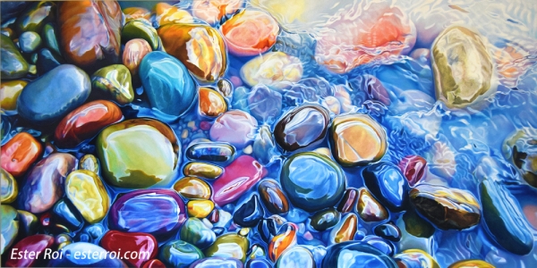

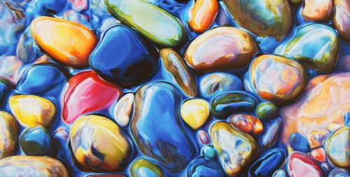
Title: "Everlasting"
Size: 24" x 48"
Medium: Prismacolor and Caran d'Ache Luminance Colored Pencils, Neocolor Wax Pastels, Holbein Oil Pastels
Surface: Extra Fine Texture Canvas primed with two coats of clear Art Spectrum Colourfix Primer
Icarus Technique



“Cambria”

Title: "Cambria"
Size: 6.5" x 11.5"
Medium: Caran d'Ache Luminance Colored Pencils
Tools: Tortillions, Paper Stumps, Full Blender Bright
Surface: Extra Fine Texture Canvas primed with two coats of clear Art Spectrum Colourfix Primer
Technique: Icarus Drawing Board

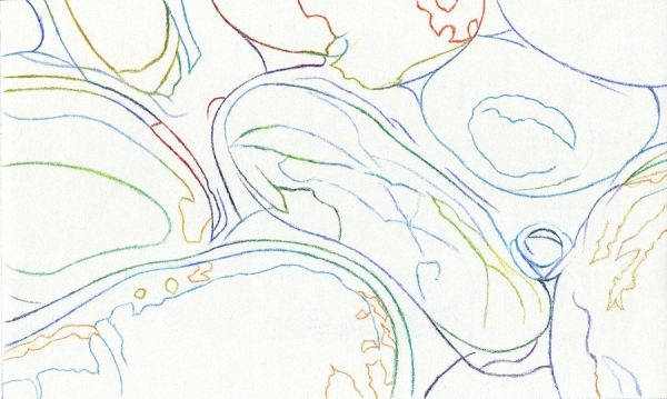
Above is the outline of this project. It's a combo piece of two small artworks I did in the past. After I developed the drawing in graphite, I transferred it onto the canvas using local colors.

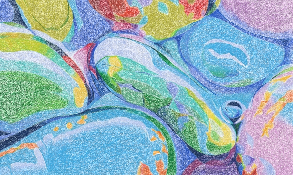
Here I've blocked-in the main colors using a low temperature setting, just enough heat to make the layering a little faster and more even. Now I have a clear map of the basic colors.

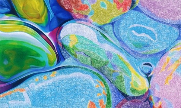
After turning up the temperature dial to a medium setting I began burnishing. This is the process of saturating the canvas with pigment. I'm developing the values while blending colors and adding details. The only tools I use, besides the Icarus board, are tortillions, paper stumps, and a colorless blender.

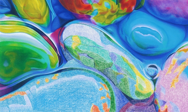
More burnishing and blending in progress.

More burnishing and blending in progress

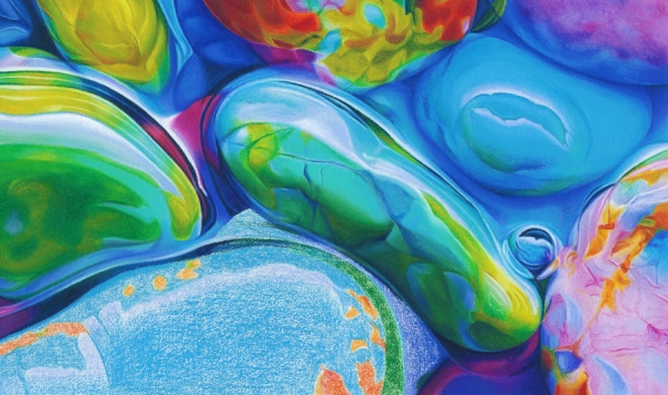
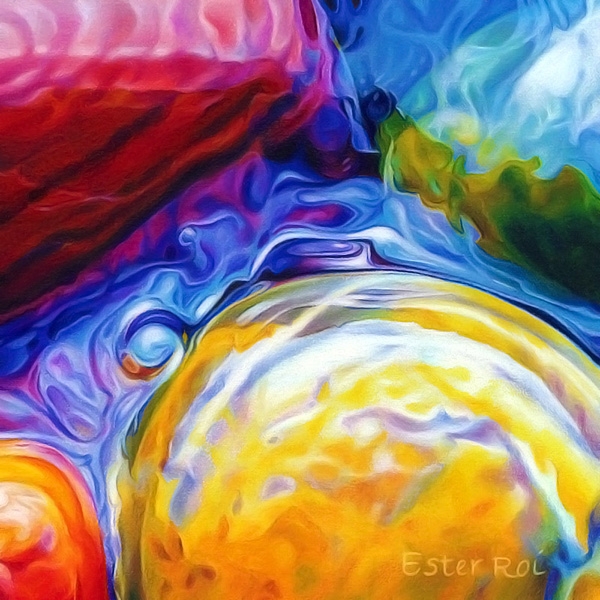
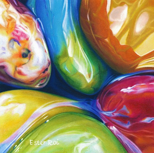
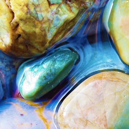
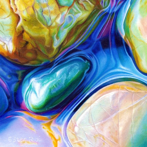
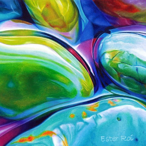
And finally the finished artwork. The title is after the location on the California Central Coast where I collected these pebbles.   


“River Pebbles, No. 12”

Title: River Pebbles, No. 12

  • Size: 6" x 6"
  • Medium: Prismacolor Premier Colored Pencils (Verithin and Softcore), Caran d'Ache Luminance Colored Pencils
  • Tools: Tortillions, Paper Stumps
  • Surface: Extra Fine Texture Canvas primed with several coats of clear Art Spectrum Colourfix Primer
  • Technique: Icarus Drawing Board
  • Mounted on a 6" x 6" x 2" Ampersand Claybord and varnished
  • To see how I mount and varnish my artwork, please refer to my post on Glassless Framing.

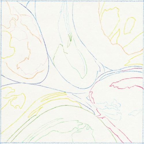
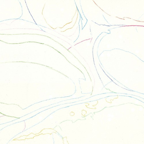
The outline was accomplished with Prismacolor Verithin on the cool zone of the Icarus board.

In this step I blocked-in the main colors on the warm zone with very low heat, just enough to soften the waxy pigments.

After setting the temperature control at medium, I began adding pigment until the canvas was completely covered. I then blended the colors with a tortillon or a paper stump.

I really enjoyed this piece. However, now that it's finished, I wish I made it larger. The swirls of colors would have looked even better on a 12" x 12". It probably would have taken me the same amount of time had I incorporated wax pastels (Neocolors).

I just mounted the canvas on a 6" x 6" x 2" Claybord. Soon I can varnish it, photograph it, and put it for sale on my website.


“Unveiled”

Title: "Unveiled"
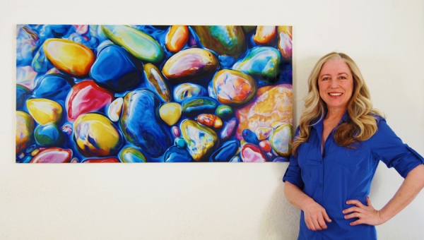
Size: 24" x 48"
Medium: Prismacolor Premier, Caran d'Ache Luminance, Derwent Coloursoft, Faber-Castell Polychromos, Caran d'Ache Neocolor I and II, Holbein Oil Pastel
Tools: Tortillions, Paper Stumps and Colour Shapers
Surface: Extra Fine Texture Canvas primed with several coats of clear Art Spectrum Colourfix Supertooth Primer
Technique: Icarus Drawing Board
Presentation: Mounted on a 3/4" Ampersand Claybord, varnished and framed

I'm very proud to have completed this piece, if nothing else for its size alone. It has accompanied me through the trials and triumphs of this past year. It's been a faithful companion even though I neglected it for long spells, at times in favor of other artworks, and later during the long months of my youngest son's illness, surgery and recovery.

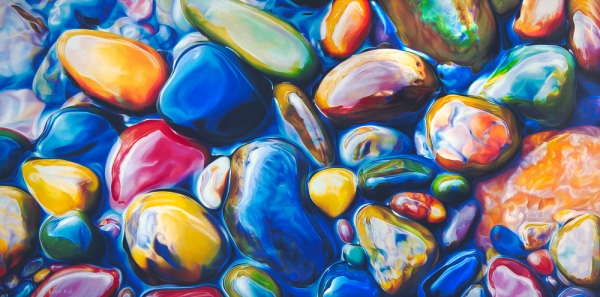
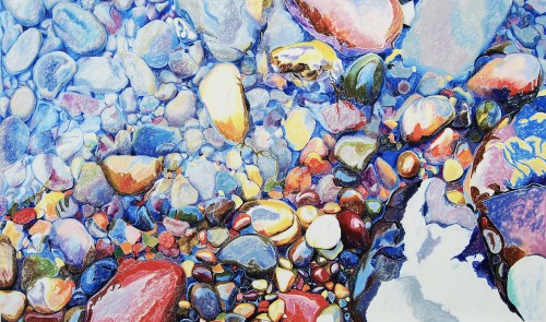
It was born out of necessity. I sold its twin brother "In Between", before I had a chance to have it professionally scanned. I had many requests for giclees so I decided to redo it four times its size. Since I was familiar with the subject and technique, I thought I could concentrate on the challenge of working on a much larger scale.
 

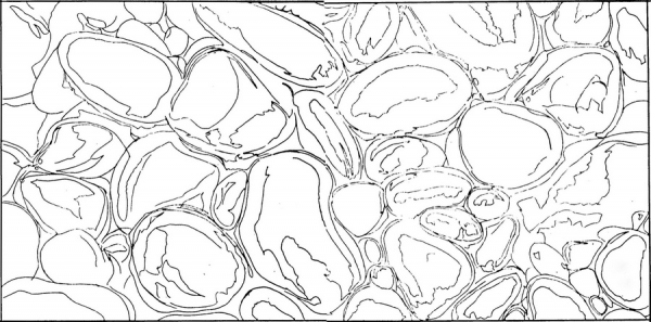
Above is the enlarged drawing I used to trace the outline on the canvas with Verithin colored pencils. I like to use local colors to avoid erasing graphite. On this blog post you can see how I traced it.
 

Of course I made some changes along the way. This progress photo shows a large stone on the bottom left corner that I eventually replaced with smaller pebbles. I used an electric eraser to lift most of the pigment and then drew new pebbles on top. 
 

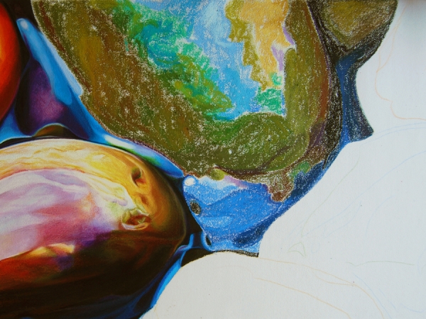
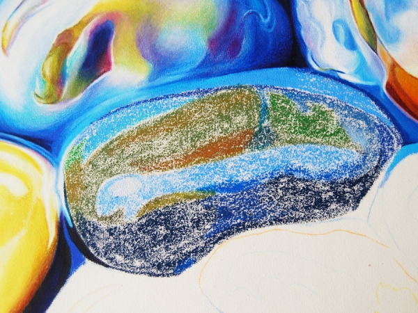
Here I mapped the area with Neocolors and oil pastels. Neocolors are very useful, especially around the edges, because they can be sharpened. Oil pastels come in such a wide selection of colors, I would be limiting my palette if I weren't using them. At this stage I set the temperature of the Icarus board to low. 


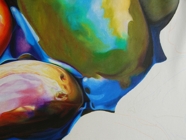
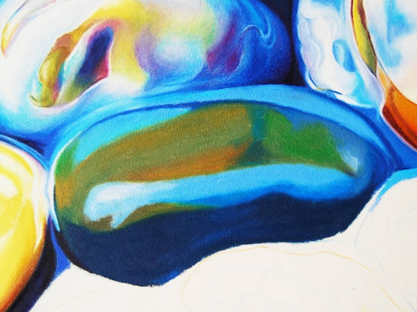
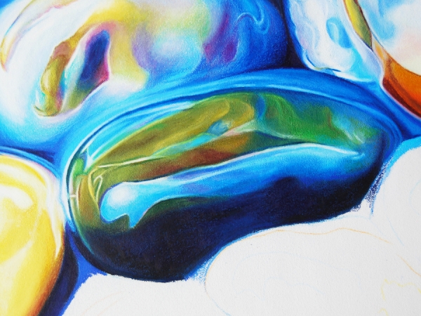
The photo above shows the results of melting the Neocolors and oil pastels. I normally melt at the highest temperature using a colour shaper. Then I blend further and pick up any extra pigment left on the surface with a paper stump. At this point the Colourfix primer's texture has resurfaced again, making the canvas receptive to colored pencils.
 

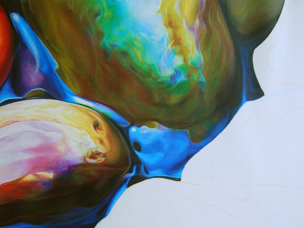
Here you can see how I further developed the colors, values and details using colored pencils, with the board set at medium-low temperature. The perfect tools for blending colored pencils are tortillions and paper stumps.
 

When blocking-in, it's not important to include all color nuances and details. These can be developed later with colored pencils. 
 

Melting the pigment is probably the most exciting application of this technique. Again, it's not necessary to create perfectly smooth blending at this stage; that's what colored pencils are for.
 

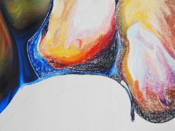
Above is another example of how I developed the colors, values and details using colored pencils.
 

In this third series of close-ups I’d like to talk about how to speed up the process. Mapping with Neocolors and oil pastels is much quicker than mapping with colored pencil. Some of these rocks can measure up to 12 square inches or more!
 

Melting the waxy pigments is a very effective technique for fast coverage of the canvas surface. It compares to dissolving water-soluble Neocolors with a brush, except there’s no color or value change with heat.
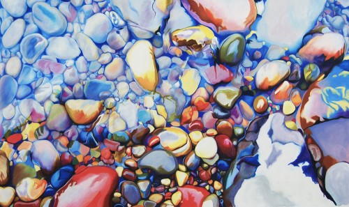
 

Another valuable time-saving technique is adding all the details at the end. Highlights are time consuming if you need to account for them from the beginning. I created all the thin highlights by subtracting the pigment with a Verithin white pencil and by going over with a softer pencil or with a sharp, white Neocolor.
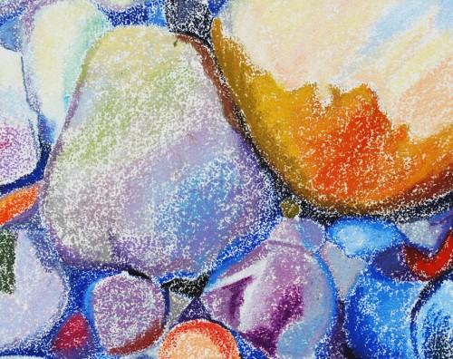
 

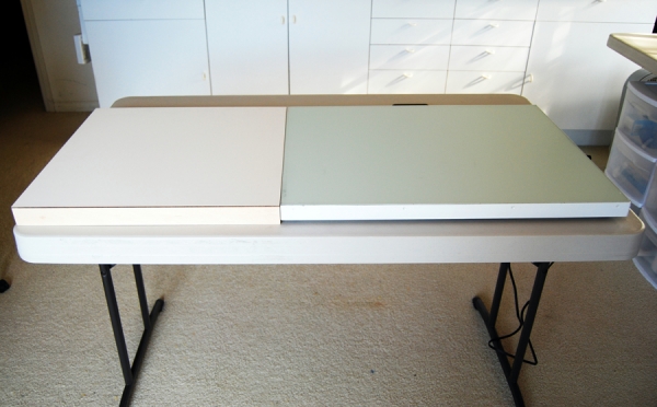
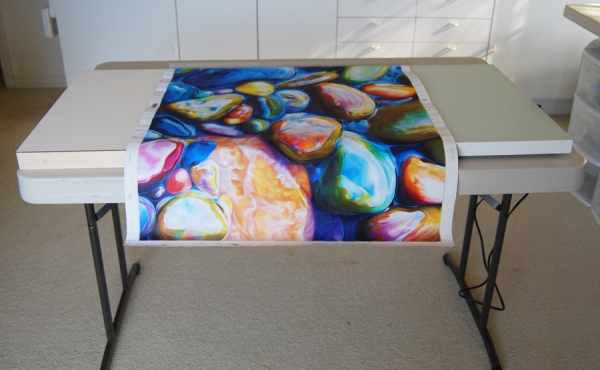
In the photo above I’m showing how I devised an easier way to work with a large canvas. I placed a 20” x 20” claybord, 2” thick, along the side of the Icarus board, thus creating a larger surface for the canvas to rest on. 
 

What’s appealing to me about working on canvas versus paper is that I don’t have to worry about creasing or bending it. Canvas is very flexible and can take a lot of abuse.


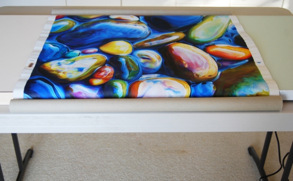
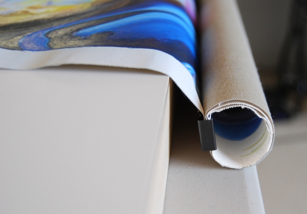
I like to roll up my canvas so that it doesn’t hang over my knees. I use two binder clips to keep the canvas from unrolling.
 

Here is a close-up of the canvas fastened with binder clips.
 

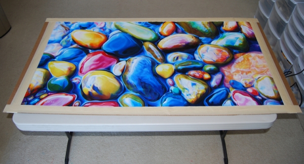
The finished canvas is now taped to a cardboard and ready for spraying.
 

After mounting the canvas on a cradled board, I will then varnish it and frame it.


Pushing the Limits

Last summer at the Laguna Beach Festival of Arts I had the opportunity to talk to hundreds of visitors and many of them inquired if I had large-scale work available. This rekindled my longstanding desire to create bigger art.

After much experimenting I realized that the best way to accomplish this goal was to find a flexible surface that I could place on top of my Icarus board without damaging it (the surface). I knew that paper was not my best choice because large sheets tend to crease or bend when used on a desk.

I tested various substrates and found that canvas had the flexibility needed for my purpose. I purchased a roll of Caravaggio Extra Fine Double-Primed Cotton Canvas, the finest texture canvas available. Artists who would like to experiment with canvas and the Icarus board for the first time are advised to purchase a portrait-grade stretched canvas, unstaple it from the bars, and then, after the painting is finished, re-stretch it on the same bars.

My first attempt to work large was a 28" x 48" piece, temporarily named The Quarry. I primed the canvas with three coats of Art Spectrum Colourfix Supertooth Primer, clear. This primer helps colored pencil and wax & oil pastel adhere well to the canvas. When I prefer a smoother texture I use the regular Art Spectrum Colourfix Primer, clear instead.

Below you can see the first two passages I accomplished:

First passage: blocking-in

Second passage: melting

Blocking-in detail

Melting detail

As I was getting ready to tackle the third and final passage to develop color, values, and details, I changed my mind about finishing The Quarry and put it temporarily aside.

One of my favorite artwork, In Between (see image below), sold as soon as I posted it on my blog. I had something special planned for that piece!

In Between

For that reason, after asking permission to my collector and changing its size, I decided to re-do it four times as big as the original. If you're interested in this topic of making repeats, I suggest you read Robert Genn's newsletter Identical Twins.

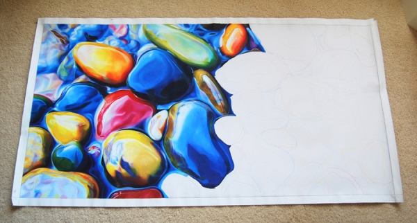
Soon I began working on the 24" x 48" twin of In Between. I'm only about half-way done because other more urgent, smaller pieces are taking precedence.

The strategy I'm following with the 'twin' is different than that of The Quarry. Since it's a re-do, I don't feel the need to block-in the whole composition and colors. As you can see from the image below, I'm completing one stone at a time.

Eventually, as I garner more experience with large sized artwork using the Icarus board, I will share with you all the tips and tricks learned along the way.

The 'twin' halfway done

When I was a little girl my father used to ask me: "Ester, why do you always push the limits?". He was naturally worried! I understand now, because I have a son who's exactly like me.


How to Mount Paper on Board

Mounting paper on board using Grafix Double Tack Mounting Film can be challenging at first. This mounting film is permanent and accidents can happen, especially if one doesn't practice ahead.

I've being using this method for years and I'm quite comfortable with it. It takes me about 10 or 15 minutes to mount a piece, depending on the size.

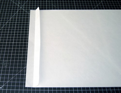
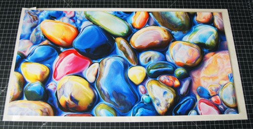
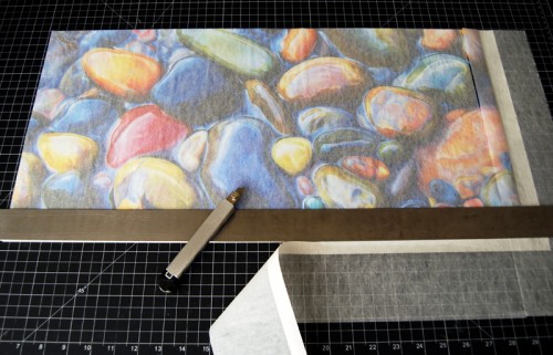
Above is my finished artwork "In Between" which I will mount on a 12" x 24" x 3/4" thick Ampersand Claybord. At this point my piece measures 12.5" x 24.5", half an inch larger than the board, to account for possible misalignment during mounting. I've already trimmed the white paper edge that I normally leave around the drawing.

This is the back of my artwork which I wiped with a clean cotton rag to make sure there are no pencil debris left on the paper. I always use tracing paper to protect my piece from the cutting board.

Grafix Double Tack Mounting Film is acid free and archival. It has a coat of permanent adhesive on both sides of a thin film, sandwiched between two heavy release papers.

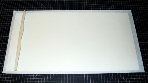
The image above shows the double tack mounting film which is cut a bit larger than the original artwork. I'm lifting the top release paper to expose part of the tacky area; this will be a section about an inch wide. It's always better to release more paper than necessary and then let it fall back into place up to the area that will need to be exposed.

Here I folded the top release paper back, exposing only an inch of the tacky film.

After placing my artwork over the double tack mounting sheet, I made sure it was centered inside the perimeter. At this point the artwork can still be moved because it's not making contact with the tacky film.

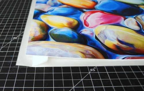
A close-up of the artwork positioned over the fold.

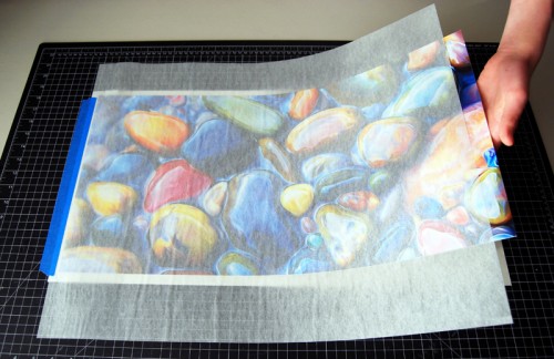
With a protective sheet of tracing paper over the artwork, I pressed down on the left side to make contact with the exposed tacky sheet. I then secured it onto the cutting board with tape.

Afterwards I lifted the right side of the artwork and slowly began pulling the release paper from underneath. At the same time, with my other hand, I rubbed the surface with a rag, moving back and forth from one side to the other, until all the release paper is out.

At this point I trimmed the edges of the double tack sheet (and tracing paper) with a sharp X-Acto knife.

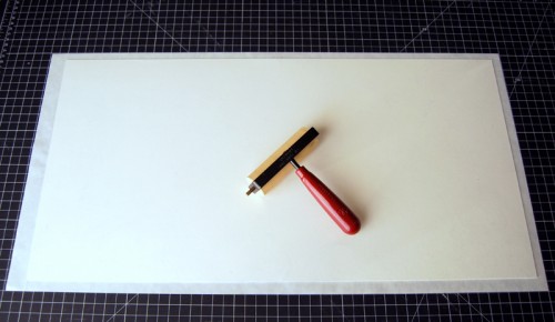
I turned over the artwork and placed it face down on the cutting board, using the waxy release paper I just pulled from the tacky sheet as a protection layer. Then I rolled a rubber brayer all over the surface to reinforce the adhesion.

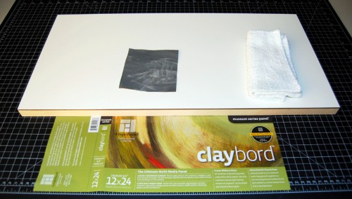
Here's my 12" x 24" Ampersand Claybord. I cleaned the surface with a rag and lightly sanded the sides with extra-fine sandpaper.

To pull out the other release paper from the back of the artwork I used the same method as before, exposing a 1.5" area of the tacky sheet.

Then I placed the Claybord over the mounting sheet and centered it. Again, I can still re-position it at this point because the board is not making contact with the tacky film.

Once the board is perfectly centered over my artwork, I pressed down on the left side to make contact with the exposed tacking sheet.

After placing a sheet of tracing paper over the artwork,  I lifted the right side and slowly began pulling the release paper from underneath. At the same time, with my other hand, I rubbed the surface with a rag, moving back and forth from one side to the other, until all the release paper is out.

Here you can see it from the opposite side.

Once the artwork is mounted onto the board, I pressed down first with a rag and then with a rubber brayer.

I turned the Claybord over.

I trimmed the extra with an X-Acto knife.

To achieve perfect cuts I used a fresh blade for each side of the artwork.

Finally I placed the board under heavy books overnight.

My artwork is now ready for varnishing and framing.

Thank you for visiting!


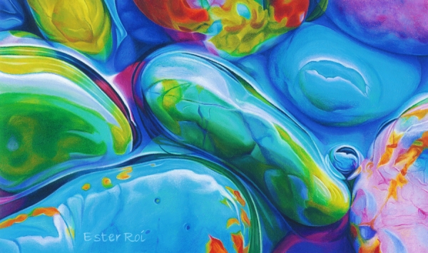
“River Pebbles, No. 11”

River Pebbles, No 11

Title: River Pebbles, No. 11

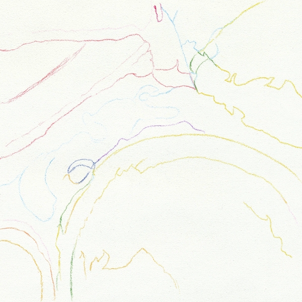
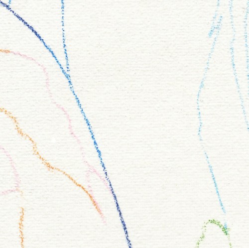
Outline - Cool Zone

The outline was accomplished with Prismacolor Verithin on the cool zone of the Icarus board.

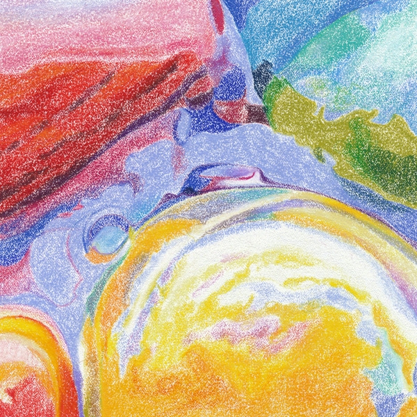
Color Mapping - Warm Zone - Low Temperature

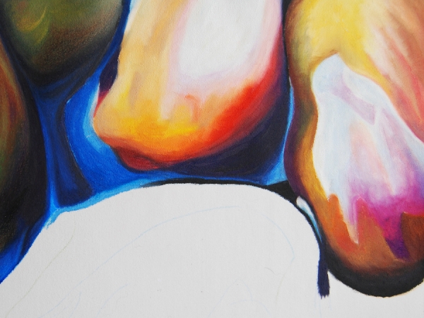
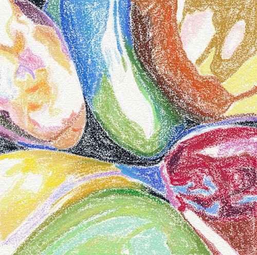
After drawing the outline I proceeded to map the main colors with Neocolor artist crayons on the warm zone of the Icarus board using a low temperature.

For more on color mapping with artist crayons you can view the following videos:

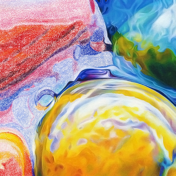
Melting - Warm Zone - High Temperature

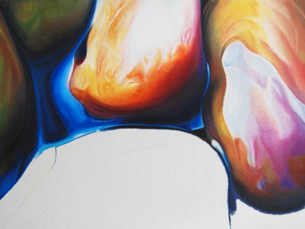
With temperature setting at maximum, I melted the artist crayons using clay shapers (also known as color shapers).

For more on melting artist crayons you can view the following videos:

Tools for Melting Artist Crayons

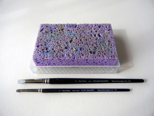
In the picture above you can see the two color shapers I used for melting and the wet sponge for cleaning. For easier cleaning I spray the surface of the wet sponge with a little Simple Green.

Outline - Detail

Color Mapping - Detail

Melting - Detail

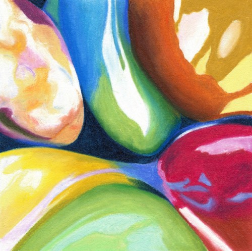
Refining - Detail

Refining with Colored Pencil - Medium Temperature

With the temperature set at medium I developed the colors, values and details of the pebbles by layering and blending colored pencils with a variety of tools like tortillions, paper stumps and a Caran d'Ache blender.

Mounted on 2" Thick Clayboard

I finally mounted the canvas on a 2" thick Claybord and painted the sides with acrylic. The artwork is now ready for varnishing.


“River Pebbles, No. 9” - Where’s Waldo?

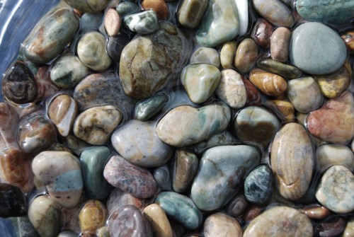
Original Photo Reference

When I look at a reference photo like the one above, the question I always ask myself is: where's Waldo?

Waldo, for an artist like me, is a good composition hidden in the randomness of nature. Even when I'm the one setting up the still life, I try not to interfere in the way pebbles fall into place. I just take many pictures while anticipating the game I will play later on my computer.

Waldo can be elusive at times. I have images taken years ago that never produced a single Waldo. But my ability to "see" is constantly evolving; I know there's a Waldo waiting to be found even in the most hopeless image.

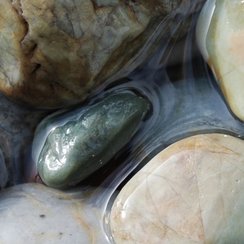
Composition

Meet Waldo! I found him in the center of the image. Now that I have him, I want to show him off but, as you can see, he looks a little drab. Light and color will do magic.

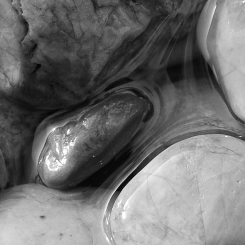
Values

Here's what he looks like in black and white.

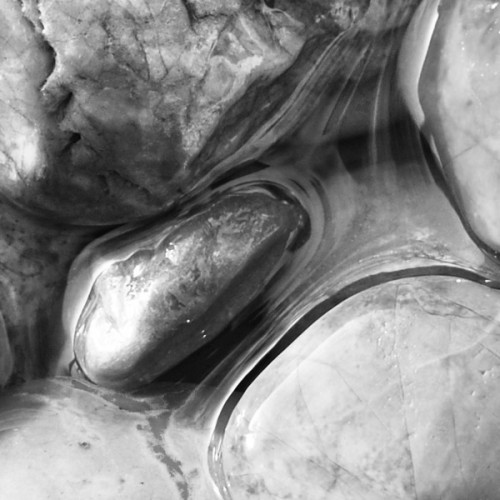
Values Adjusted

Much better - Waldo is coming to life. I just lightened the top left quadrant and pushed the overall value contrast.
Colors Adjusted

Now we're talking!
River Pebbles, No. 9

And here is my finished piece - in honor of Waldo of course!

Title: River Pebbles, No. 9

For techniques used in this artwork, please see blog post River Pebbles, No.3 - Melting Artist Crayons


“River Pebbles, No. 7”

River Pebbles, No. 7

Title: River Pebbles, No. 7

Outline - Cool Zone

The outline was accomplished with Prismacolor Verithin on the cool zone of the Icarus board.

Color Mapping - Warm Zone - Low Temperature

In this step I blocked-in the main colors on the warm zone with very low heat, just enough to soften the waxy pigments without melting them or blending them.

Burnishing & Blending - Warm Zone - Medium Temperature

After setting the temperature control at medium, I added additional color until there was enough pigment to obliterate the paper. Then I began blending using the point of a tortillon or the side of a paper stump with a very light touch.

Colorless blenders were used to soften edges and details.