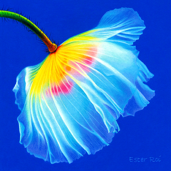
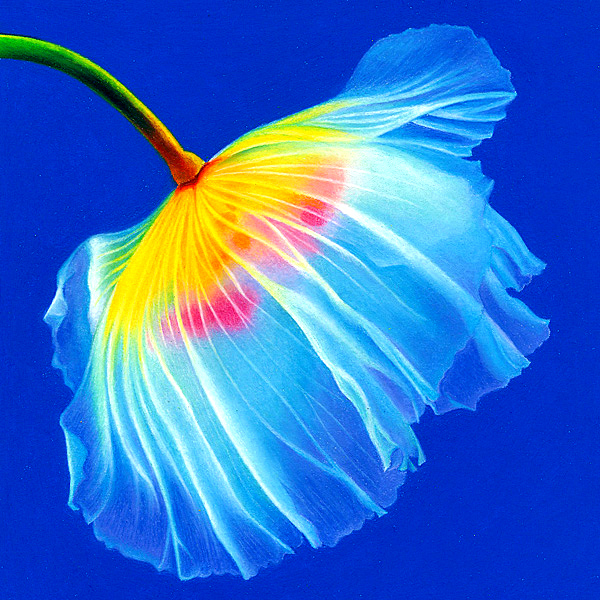
Title: Poppy, No. 3
- Size: 6" x 6"
- Medium: Prismacolor Premier Colored Pencils (Verithin and Softcore), Caran d'Ache Luminance Colored Pencils, Faber-Castell Polychromos Colored Pencils
- Surface: Fabriano Artistico Extra White, Hot Press, 300 LB - primed with a thin coat of clear Colourfix Primer
- Miscellaneous: Tortillions & Paper Stumps
- Technique: Icarus Drawing Board
- Mounted on a 6" x 6" Ampersand Claybord (1/8" thick) and framed. To learn how I mount and varnish my artwork, please read my post on Glassless Framing.
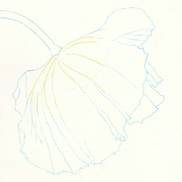
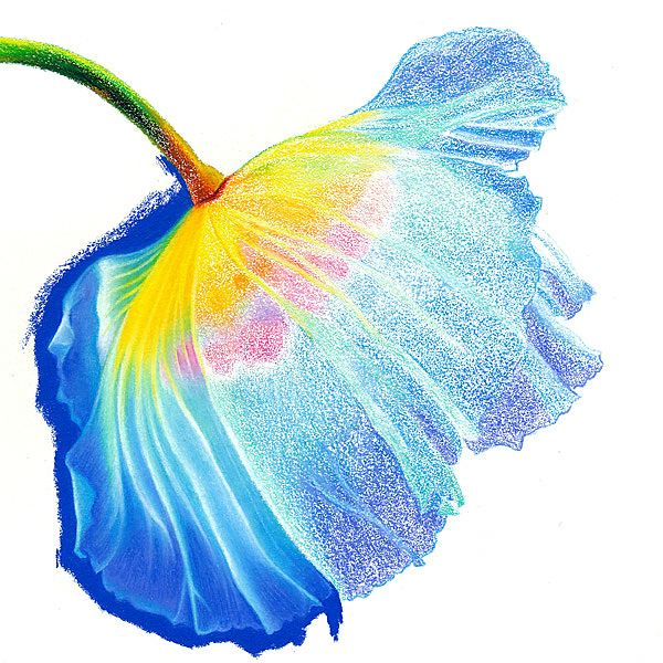
The outline is accomplished with Prismacolor Verithin on the cool zone of the Icarus board. I don't like to add too many details at this point, only the principal lines.
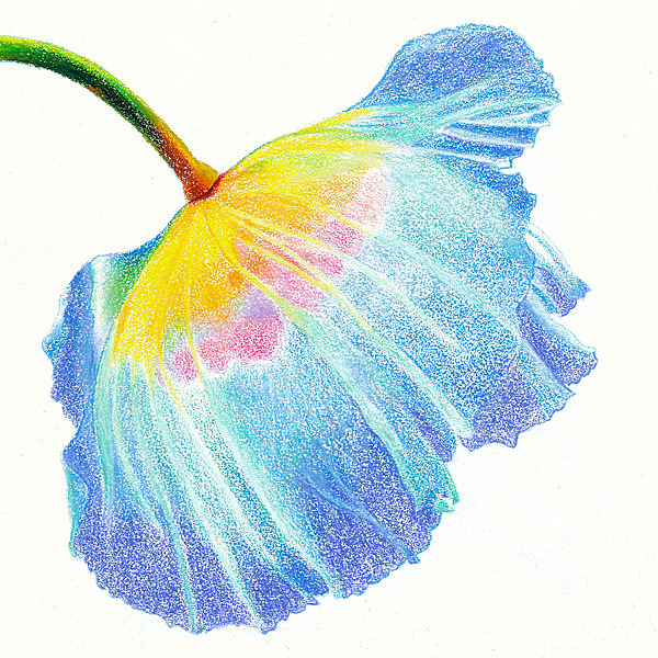
I'm blocking-in the main colors of the poppy on the warm zone with very low heat, just enough to soften the waxy pigments without melting them or blending them.
After setting the temperature control at medium, I add additional color until there's enough pigment to obliterate the paper. Then I begin blending using the point of a tortillon with a very light touch.
Sometimes I smooth out the color gradations with the side of a paper stump if the area in question is large enough. The very small veins are created with a white Verithin which lifts and lightens the original color underneath.
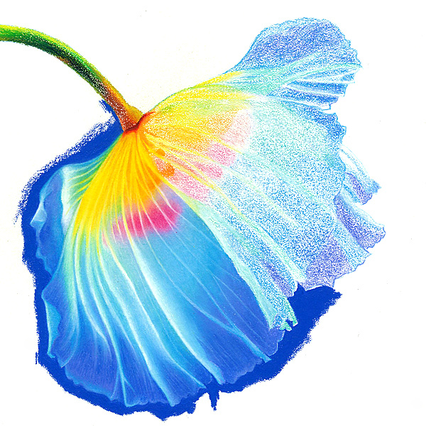
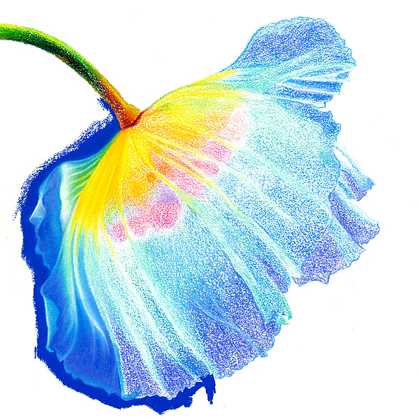
The last step includes refining the edges (cool zone), polishing the color gradations (warm zone), adding the fuzz on the stem (warm zone), filling in the white speckles of paper that are still showing (warm zone), and the signature.
I like to sign my name with a Verithin pencil on the warm zone. I use a lighter color than the background and press enough to create an indentation which is visible even after varnishing.
10 comments
Terry Rempel-Mroz
April 27, 2012
Beautiful as always. The steps really demonstrate your skill with the medium - bravo!
Ester Roi
April 27, 2012
Kind as always, Terry!
Jill
April 27, 2012
Beautiful! My eye traveled throughout the whole picture at first, but then the stem really caught my eye. I love how the color gradation goes from yellow into green.
Lisa Hetrick
April 27, 2012
Thanks you for sharing! Just stunning and I love how you broke it down so as to see the transformation. Jaw dropping really. I also love the 6x6 size.
Linda Mahoney
April 27, 2012
This is the exact tutorial I was going to request from you. Yea!! Question: When you use the white Verithin to do the small veins, do you apply it over the color that was already blended? I was stumped on this part. Also, I am very grateful to you to do one that is only colored pencil. You are so wonderful to share!
Ester Roi
April 27, 2012
Thank you, Jill! I always try to push the colors to the edge of realism.
Ester Roi
April 27, 2012
Thank you, Lisa! I’m glad you enjoyed it.
Ester Roi
April 27, 2012
Thank you, Linda!
Yes, I apply the white Verithin over the color that was already blended. I use it for very thin lines and small highlights. Verithin is very hard and when you use it with heat, especially on sanded paper like Colourfix, it will lifts the previous color to create the veins - very easy to do and time saving. If you want to fill in the ridge, move your paper to the cool zone and retrace the vein with a sharp softer pencil.
I really enjoy this sharing process and I’m happy you get something out of it. Look for more colored pencil step-by-steps in the near future.
Terry L Zarate
July 08, 2012
Ester, just beautiful! I appreciate your newsletters and instructions. Thank you so much for taking the time. Happy painting.
Terry
Ester Roi
July 08, 2012
Thank you, Terry! I’m so glad my newsletters and instructions are helpful. Happy painting to you too!