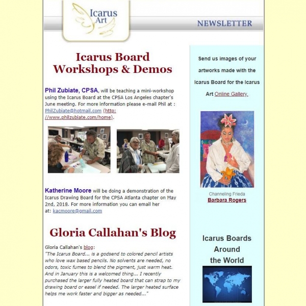
The Icarus Art Spring 2018 Newsletter was recently sent out. Click on this link to read it. If you'd like to register for the newsletter, go to the homepage of Icarus Art and click the sign-up button on the top right corner.
Subscribe to my newsletter to receive 4 to 5 emails per year where I highlight important news, available originals, and seasonal specials.

The Icarus Art Spring 2018 Newsletter was recently sent out. Click on this link to read it. If you'd like to register for the newsletter, go to the homepage of Icarus Art and click the sign-up button on the top right corner.
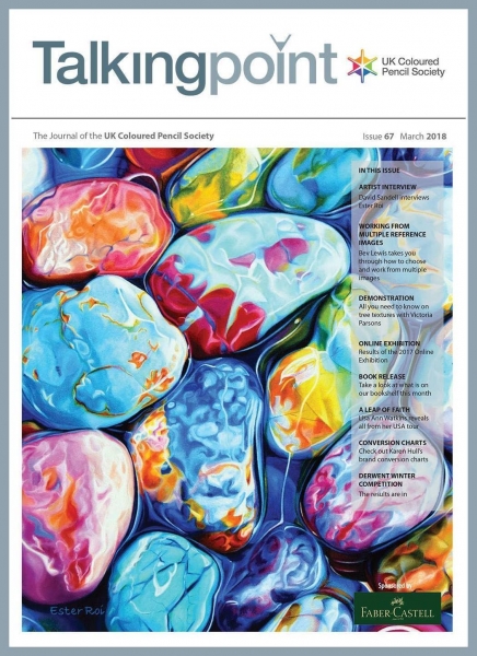
I'm thrilled to have been published in the UK Coloured Pencil Society's quarterly magazine "Talking Point", with my art on the cover and a six page interview inside. If you're not a member of this wonderful organization and would like to receive the magazine, visit their membership page here.
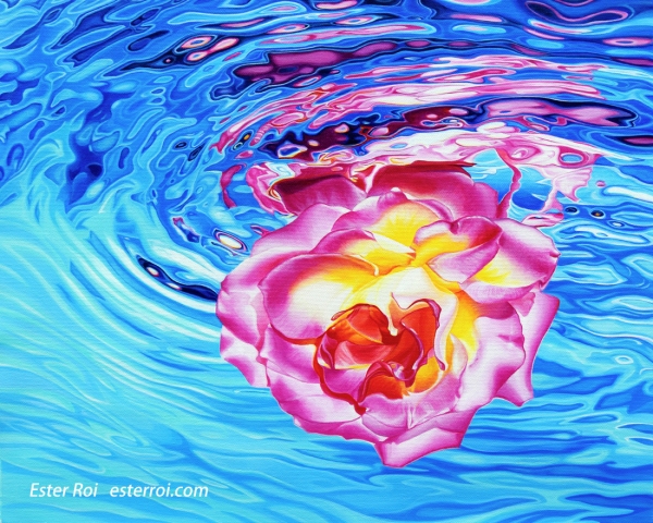
Title: "The Other Side"
Size: 16" x 20"
Medium: acrylics
Surface: canvas mounted on board
In the past I have used acrylics for color mapping under drawing media but never acrylics alone (except in college many years ago). This time the decision to switch to acrylics was made for me as the brilliant colored pencil pinks and purples I was planning to use were all fugitive. Luminance does offer several lightfast pinks and purples but they are not as vibrant as the colors I was after. Plus, I already had a large selection of acrylic paints in my studio.
I didn’t want to change my style and I was planning, as much as possible, to create a painting that looked like my drawings: colorful, realistic, with hard and soft edges and smooth blending passages. I expected to do much layering but I wanted to try some techniques to minimize it.
I tested a variety of professional, heavy body acrylic brands and I was impressed by their richly saturated pigments, buttery consistency and lightfastness; gone is the plastic look I remember from my college days. Unfortunately, they still present a color shift from wet to dry, some brands more than others.
To facilitate blending I experimented with a retarder, with an airbrush (to keep the paint wet with water on the canvas), and with Golden Open acrylics. I live in Southern California where the climate is usually dry and warm. Golden Open Acrylics stayed blendable for a much shorter time than I expected. They would probably perform better in thick layers and in places with higher humidity and colder temperatures. I didn’t like using the retarder very much as it made the paint too sticky. The airbrush worked well but the water thinned down the already thin layers way too much for my liking.
I will continue to use acrylics for underpainting with colored pencils or with oils and use them alone for small size art. What I liked the most about them is their versatility and how they lend themselves to experimentation. What I liked the least is their color shift from wet to dry. I guess one can get used to it after a while but I really struggled with it.
There are many artists who create incredible art with acrylics. Whether they apply them with an airbrush, rely on optical mixing without blending, or use a mélange of techniques, at the end it’s the result that counts. Art mediums are like people; they come with different personalities, strengths and weaknesses. No matter what medium one is attracted to, a great relationship is only possible after a lot of work and perseverance.
Click here to see how I use acrylics with colored pencils.
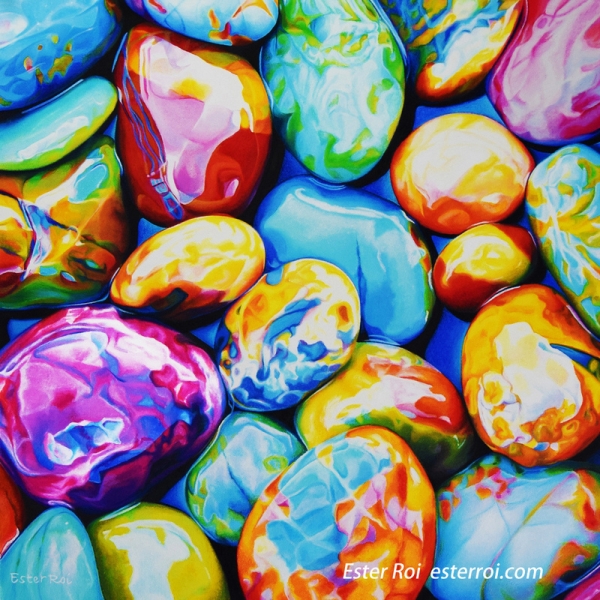
Title: "Pebbles from Heaven, No. 3"
Size: 16" x 16"
Outside frame size: 23" x 23"
Medium: colored pencils, wax pastels and oil pastels
Surface: Art Spectrum Colourfix Supertooth board
Technique: Icarus Painting Board
Original available here. 25% of the proceeds will be donated to Caterina's Club, a charity that provides free, warm, nutritional meals to underprivileged children in Orange County.
Giclees available here.
More information on my "Pebbles from Heaven" series on this blog post.
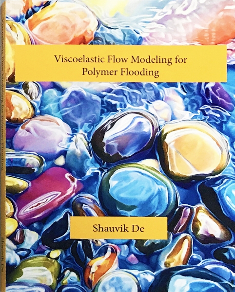
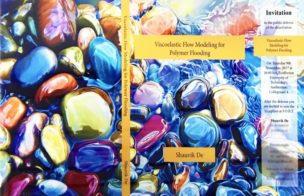
My painting “Everlasting” is on the cover of Shauvik De’s PhD thesis. His research is on computational modeling and experiments of "non-newtonian flow through porous media". He told me: “Primarily I study how fluids flow through rock structures.Your art form of rock paintings is an artistic interpretation of a scientific problem”.
I think it’s a match made in heaven!
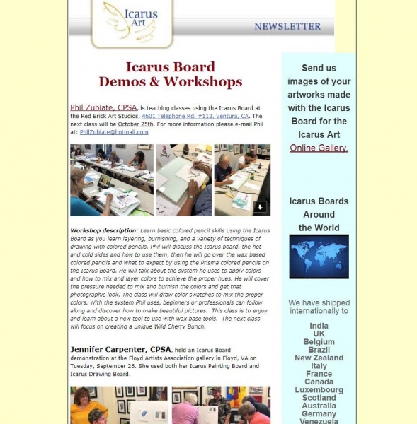
The Icarus Art Fall 2017 Newsletter was recently sent out. Click on this link to read it. If you'd like to register for the newsletter, go to the homepage of Icarus Art and click the sign-up button on the top right corner.
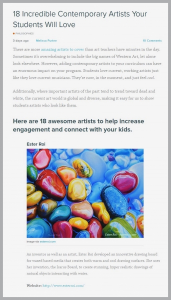
I'm very honored to be one of 18 contemporary artists that, according to The Art of Education, art teachers should include in their curriculum.
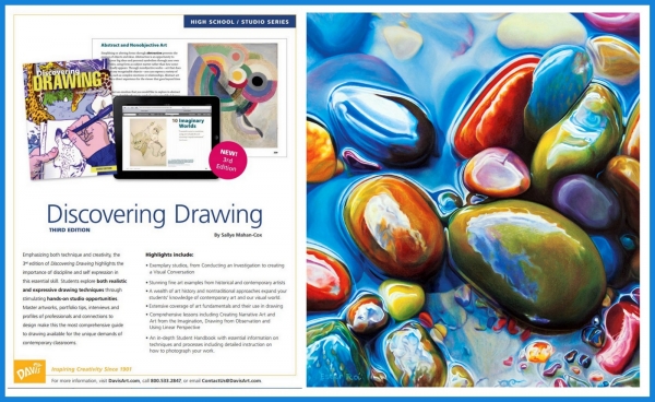
I'm very happy that my artwork "Impasse" was published in the third edition of "Discovering Drawing" by Sallye Mahan-Cox, Davis Publications, a textbook for high school students in the United States.
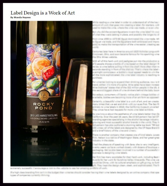
I'm very honored that the wine label with my artwork "Crescendo" is featured in the article "Label Design is a Work of Art" in The Grapevine Magazine. You can read the full article on their website.
"Crescendo" is displayed on the labels of several different wines by Rocky Pond Winery from Washington State. Sara Nelson Design did a magnificent job with the wine labels.