Holiday 2021 Promo15% off all artwork, limited time offer!

Newsletter Subscription

Subscribe to my newsletter to receive 4 to 5 emails per year where I highlight important news, available originals, and seasonal specials.

Blog Category: Icarus Technique

Pushing the Limits

Last summer at the Laguna Beach Festival of Arts I had the opportunity to talk to hundreds of visitors and many of them inquired if I had large-scale work available. This rekindled my longstanding desire to create bigger art.

After much experimenting I realized that the best way to accomplish this goal was to find a flexible surface that I could place on top of my Icarus board without damaging it (the surface). I knew that paper was not my best choice because large sheets tend to crease or bend when used on a desk.

I tested various substrates and found that canvas had the flexibility needed for my purpose. I purchased a roll of Caravaggio Extra Fine Double-Primed Cotton Canvas, the finest texture canvas available. Artists who would like to experiment with canvas and the Icarus board for the first time are advised to purchase a portrait-grade stretched canvas, unstaple it from the bars, and then, after the painting is finished, re-stretch it on the same bars.

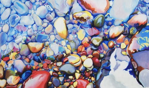
My first attempt to work large was a 28" x 48" piece, temporarily named The Quarry. I primed the canvas with three coats of Art Spectrum Colourfix Supertooth Primer, clear. This primer helps colored pencil and wax & oil pastel adhere well to the canvas. When I prefer a smoother texture I use the regular Art Spectrum Colourfix Primer, clear instead.

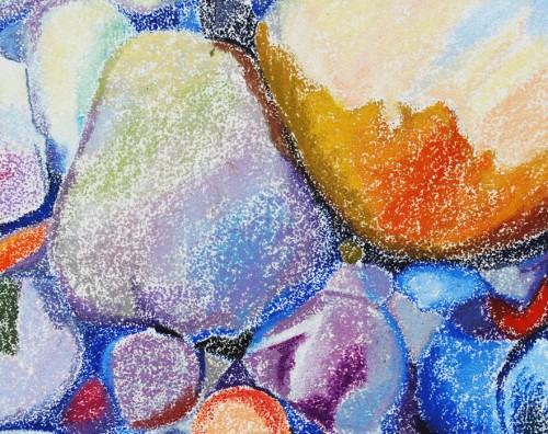
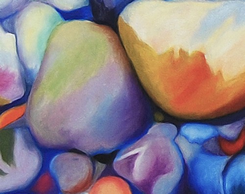
Below you can see the first two passages I accomplished:

First passage: blocking-in

Second passage: melting

Blocking-in detail

Melting detail

As I was getting ready to tackle the third and final passage to develop color, values, and details, I changed my mind about finishing The Quarry and put it temporarily aside.

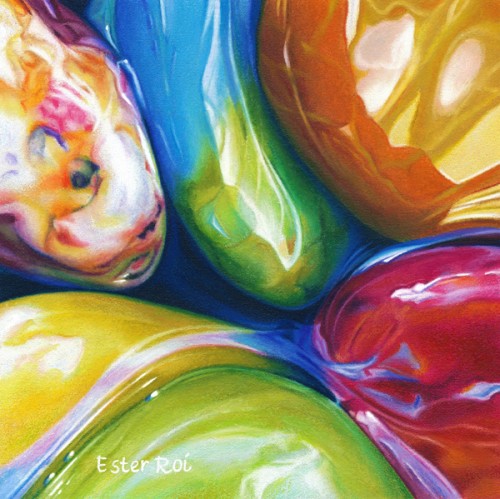
One of my favorite artwork, In Between (see image below), sold as soon as I posted it on my blog. I had something special planned for that piece!

In Between

For that reason, after asking permission to my collector and changing its size, I decided to re-do it four times as big as the original. If you're interested in this topic of making repeats, I suggest you read Robert Genn's newsletter Identical Twins.

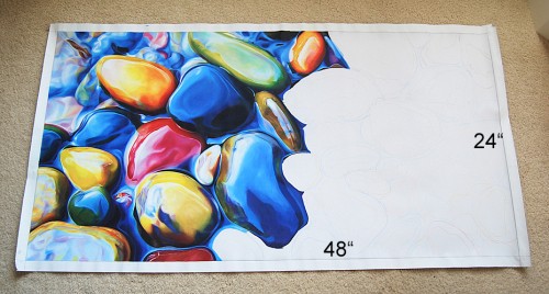
Soon I began working on the 24" x 48" twin of In Between. I'm only about half-way done because other more urgent, smaller pieces are taking precedence.

The strategy I'm following with the 'twin' is different than that of The Quarry. Since it's a re-do, I don't feel the need to block-in the whole composition and colors. As you can see from the image below, I'm completing one stone at a time.

Eventually, as I garner more experience with large sized artwork using the Icarus board, I will share with you all the tips and tricks learned along the way.

The 'twin' halfway done

When I was a little girl my father used to ask me: "Ester, why do you always push the limits?". He was naturally worried! I understand now, because I have a son who's exactly like me.

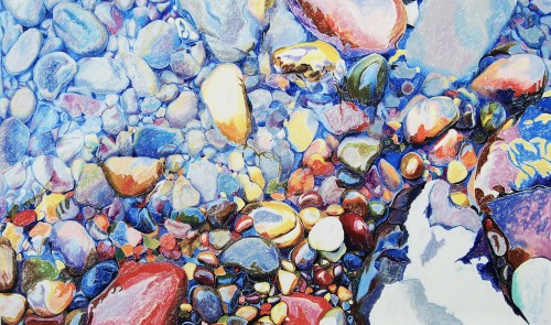
 

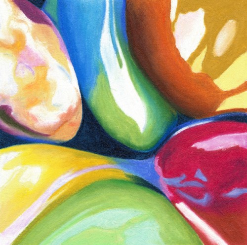
“River Pebbles, No. 11”

River Pebbles, No 11

Title: River Pebbles, No. 11

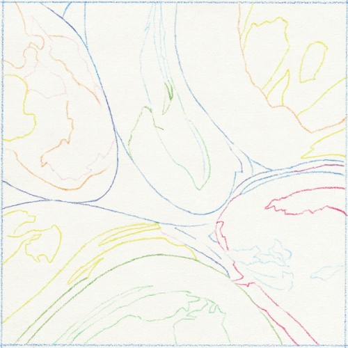
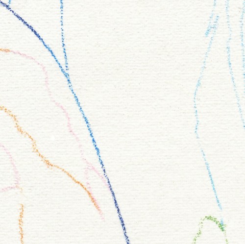
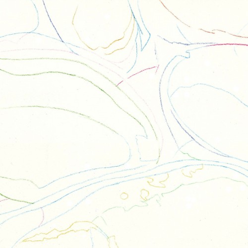
Outline - Cool Zone

The outline was accomplished with Prismacolor Verithin on the cool zone of the Icarus board.

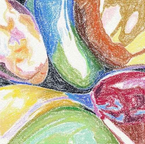
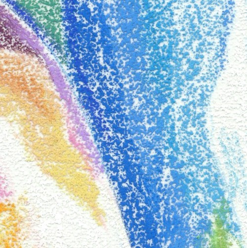
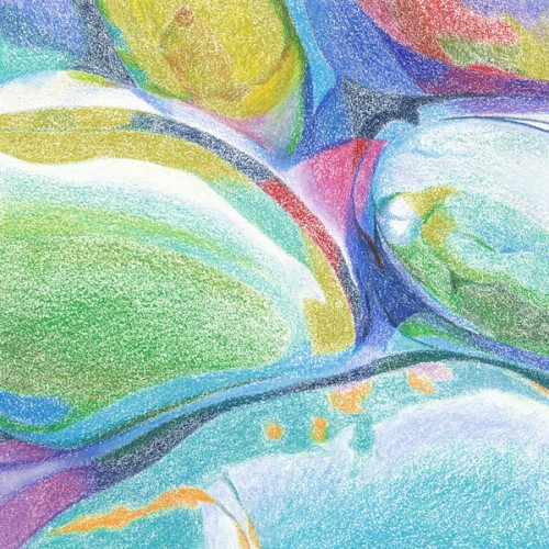
Color Mapping - Warm Zone - Low Temperature

After drawing the outline I proceeded to map the main colors with Neocolor artist crayons on the warm zone of the Icarus board using a low temperature.

For more on color mapping with artist crayons you can view the following videos:

Melting - Warm Zone - High Temperature

With temperature setting at maximum, I melted the artist crayons using clay shapers (also known as color shapers).

For more on melting artist crayons you can view the following videos:

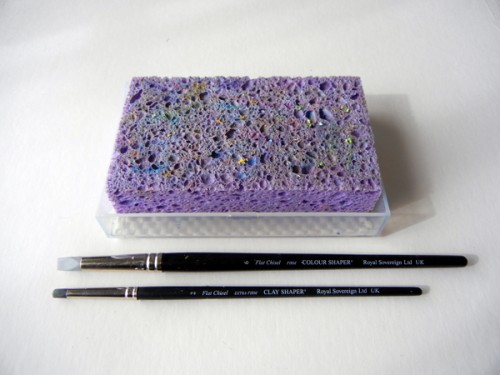
Tools for Melting Artist Crayons

In the picture above you can see the two color shapers I used for melting and the wet sponge for cleaning. For easier cleaning I spray the surface of the wet sponge with a little Simple Green.

Outline - Detail

Color Mapping - Detail

Melting - Detail

Refining - Detail

Refining with Colored Pencil - Medium Temperature

With the temperature set at medium I developed the colors, values and details of the pebbles by layering and blending colored pencils with a variety of tools like tortillions, paper stumps and a Caran d'Ache blender.

Mounted on 2" Thick Clayboard

I finally mounted the canvas on a 2" thick Claybord and painted the sides with acrylic. The artwork is now ready for varnishing.


“River Pebbles, No. 9” - Where’s Waldo?

Original Photo Reference

When I look at a reference photo like the one above, the question I always ask myself is: where's Waldo?

Waldo, for an artist like me, is a good composition hidden in the randomness of nature. Even when I'm the one setting up the still life, I try not to interfere in the way pebbles fall into place. I just take many pictures while anticipating the game I will play later on my computer.

Waldo can be elusive at times. I have images taken years ago that never produced a single Waldo. But my ability to "see" is constantly evolving; I know there's a Waldo waiting to be found even in the most hopeless image.

Composition

Meet Waldo! I found him in the center of the image. Now that I have him, I want to show him off but, as you can see, he looks a little drab. Light and color will do magic.

Values

Here's what he looks like in black and white.

Values Adjusted

Much better - Waldo is coming to life. I just lightened the top left quadrant and pushed the overall value contrast.

Colors Adjusted

Now we're talking!

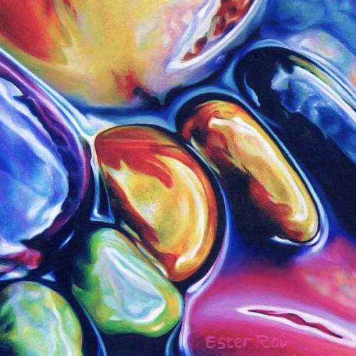
River Pebbles, No. 9

And here is my finished piece - in honor of Waldo of course!

Title: River Pebbles, No. 9

For techniques used in this artwork, please see blog post River Pebbles, No.3 - Melting Artist Crayons


“Poppy, No. 4”

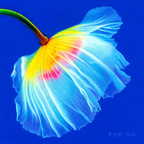
Poppy, No. 4

Title: Poppy, No. 4


“River Pebbles, No. 8”

River Pebbles, No 8


Title: River Pebbles, No. 8

For techniques used in this artwork, please see blog post River Pebbles, No.3 - Melting Artist Crayons


“River Pebbles, No. 7”

River Pebbles, No. 7

Title: River Pebbles, No. 7

Outline - Cool Zone

The outline was accomplished with Prismacolor Verithin on the cool zone of the Icarus board.

Color Mapping - Warm Zone - Low Temperature

In this step I blocked-in the main colors on the warm zone with very low heat, just enough to soften the waxy pigments without melting them or blending them.

Burnishing & Blending - Warm Zone - Medium Temperature

After setting the temperature control at medium, I added additional color until there was enough pigment to obliterate the paper. Then I began blending using the point of a tortillon or the side of a paper stump with a very light touch.

Colorless blenders were used to soften edges and details.


“River Pebbles, No. 6”

River Pebbles, No. 6

Title: River Pebbles, No. 6

In preparation for the upcoming Laguna Beach Festival of Arts I've been working on small and large pieces concurrently and I haven't had the time to scan and put together the step-by-steps and videos. However I've been jotting down all the interesting technical aspects that I encountered so that I won't forget to share them with you when time permits.

In this particular piece I struggled a bit with the surface. Colourfix Supertooth is very rough and, although it's well suited for rocks and pebbles, it might be an overkill. The bigger issue with Colourfix paper is that the texture is inconsistent, sometimes it's toothier than others and I don't like surprises.

Priming my own paper gives me much more control over the final results. It's very easy to do it and also less expensive than buying already-made Colourfix paper.


“Poppy, No. 3”

Poppy, No. 3

Title: Poppy, No. 3

Outline - Cool Zone

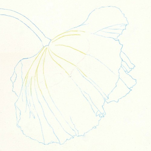
The outline is accomplished with Prismacolor Verithin on the cool zone of the Icarus board. I don't like to add too many details at this point, only the principal lines.

Color Mapping - Warm Zone - Low Temperature

I'm blocking-in the main colors of the poppy on the warm zone with very low heat, just enough to soften the waxy pigments without melting them or blending them.

Burnishing & Blending - Warm Zone - Medium Temperature

After setting the temperature control at medium, I add additional color until there's enough pigment to obliterate the paper. Then I begin blending using the point of a  tortillon with a very light touch.

Sometimes I smooth out the color gradations with the side of a paper stump if the area in question is large enough. The very small veins are created with a white Verithin which lifts and lightens the original color underneath.

Burnishing & Blending - Warm Zone - Medium Temperature

Burnishing & Blending - Warm Zone - Medium Temperature

Burnishing & Blending - Warm Zone - Medium Temperature

Refining and Polishing - Warm and Cool Zones

The last step includes refining the edges (cool zone), polishing the color gradations (warm zone), adding the fuzz on the stem (warm zone), filling in the white speckles of paper that are still showing (warm zone), and the signature.

I like to sign my name with a Verithin pencil on the warm zone. I use a lighter color than the background and press enough to create an indentation which is visible even after varnishing.


“Poppy, No. 1” - Learning from my Mistakes

Poppy, No. 1

Title: Poppy, No. 1

I need to produce lots of small artworks for the Laguna Beach Festival of Arts (by the way, I'm finally on their website) so I started a new series on poppies. With each piece I will post something interesting about how I made it.

I had never painted a small poppy before, only medium or large ones, and decided to make this a 5" x 5" project. After priming the paper with a thin coat of regular Colourfix Primer, I began to draw. It didn't take me very long to realize that this was not going to work.

A sanded pastel surface like Colourfix is perfect for pebbles and rocks and it helps to emphasize their natural texture. However it's not the best choice for smooth, flowing, transparent flowers. Stonehenge is much more suitable especially for fine details and sleek color gradations.

I resized my project to a 6" x 6" Stonehenge paper, still small but big enough for the intricate poppy. I  worked on the Icarus board at medium-low temperature and burnished all the way through the end. This time I didn't use any tools, just the pencils themselves. I blended no more than two layers and selected only colorfast colored pencils, hence the use of Polychromos when certain colors weren't available in the other brands. Oil based colored pencils like Polychromos are affected by heat if layered on top of wax-based colored pencils.

Well, this was definitely a learning experience!


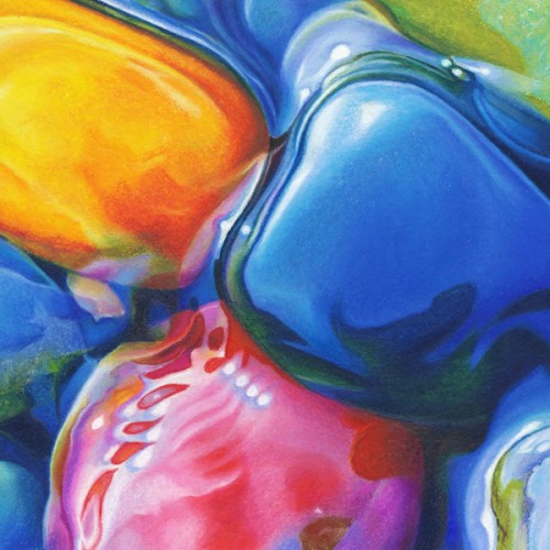
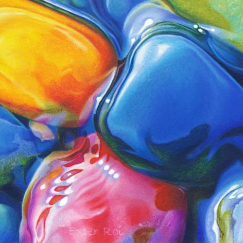
“River Pebbles, No. 4” - Stumps & Tortillions

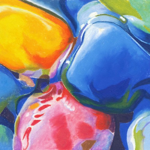
River Pebbles, No. 4

Title: River Pebbles, No. 4

Color Mapping with Artist Crayons - Cool Zone

After drawing the outline with Verithin colored pencils on the cool zone of the Icarus Drawing Board, I proceeded to map the main colors of the project with Neocolor artist crayons on the cool zone.

For more on color mapping with artist crayons you can view the following videos:

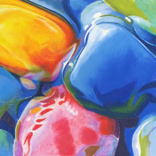
Artist Crayons Melted - High Temperature

With temperature setting at maximum, I melted the artist crayons using a clay shaper (color shaper).

For more on melting artist crayons you can view the following videos:

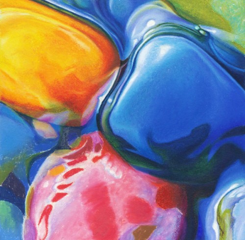
Orange Pebble Finished in Colored Pencil - Medium Temperature

With the temperature set at medium I developed the colors, values and details of the orange pebble by layering colored pencils and blending them with a tortillion.

Blue Pebbles Finished in Colored Pencil - Medium Temperature

The blue pebbles were accomplished in the same manner as the orange pebble.

Red Pebble Finished in Colored Pencil - Medium Temperature

I finished the drawing by completing the red pebble in the same manner as the other pebbles.

Clean-up, Highlights and Signature

Finally I cleaned up the drawing and emphasized the highlights with a white artist crayon. I like my signature to blend in and I can achieve that by using a sharp, white Verithin on the warm zone. It lightens the colors underneath just enough to make the letters visible without detracting from the art.

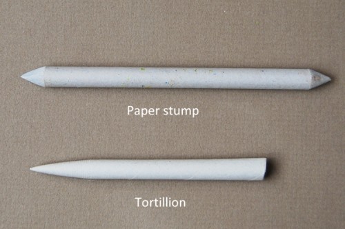
Paper Stump and Tortillion

When I first started experimenting with heat I was always on the lookout for different tools that would work with my technique. I remember trying tortillions and disliking them. I found that I couldn't really use them by the long side of the point because they would leave indentations/ridges on the waxy pigments.

The paper stumps that I normally use for large artwork were too thick and soft for this small project. At the same time I was getting very frustrated with how inconsistent the various colorless blenders have been lately. Finally I decided to give the tortillion another try and, guess what? It works great! The point is very thin and sturdy, not as soft as the paper stump's, perfect for blending colored pencils. It's easy to clean with sandpaper and very inexpensive. If you're using it already, you're way ahead of me. If you're not, try one and you'll be pleased!